


OVERVIEW
My Role
UX Designer
Team
Daberechi Okorie - Product Manager
Alice Meng - Design Manager
Kim Nguyen - UX Designer
Jessica Sotelo - UX Designer
Aesha Patel - UX Designer
Dheeraj Purohit - UX Designer
I volunteered as a UX Designer for Develop for Good, which is a digital agency that provides design and engineering services for non-profit organizations. I was part of a design team for the Boys & Girls Clubs of North San Mateo County located in San Francisco. They are a non-profit organization that focuses on providing services/programs to support the growth and development of youth.
Timeline
May - August 2023
PROCESS

PROBLEM
The Boys & Girls Clubs is experiencing a low conversion rate due to declining program enrollment numbers and a low amount of donations received.
Original

Redesigned

The original website has inconsistent wording, confusing UI elements and violates several usability heuristics, which leads to unengaged users who are not motivated to go through with call to actions. Redesigning the website can allow a better portrayal of brand values, while modernizing the interface and improving the user experience to boost engagement and conversions.
DESIGN CHALLENGE
In order to improve the organization’s conversion rate for program enrollment and donations…
#1. How can we guide parents/guardians through a clear and seamless program enrollment process?
#2. How can we encourage donors to contribute through an impactful, engaging website experience?
USER RESEARCH
There are inconsistencies that causes confusion about user flow and there is a lack of call to actions, while being presented in an outdated interface .
By interviewing and conducting usability testing with 5 participants, we came to an understanding that there are 3 main themes that are impacting the conversion rate:

Theme #1: Inconsistencies create a confusing enrollment process when parents are registering their children into programs.
Different wording is used for the same action: “Enroll” vs “Become a Member” vs “Register on the Portal”. This causes an illusion that there are a lot of steps in the user flow and makes the user question what the next step should be.

Theme #2: There is an unclear call to action for donations.
Poor visual hierarchy: The flatness and blandness of the website doesn’t draw the user’s attention to donations.
Out of sight, out of mind: As users navigate around the website, the donation feature is not visible. The more likely that a user doesn’t see the donation feature, the more likely that they will not be prompted to take action.

Theme #3: The outdated interface amplifies users’ inability to stay engaged in the website.
Cluttered content: There is information that don’t add value to the user’s ability to understand core content.
Large chunks of text: Many pages are covered in a large amount of text, which demotivates users from reading the content.
USER PERSONAS
Based on our user research, we discovered there are two main types of users: Parents/guardians of youth aged 13-18 and donors. We defined the website’s main target market to ensure that we are designing with these personas in mind.


COMPETITIVE ANALYSIS

A competitive analysis was conducted in order to understand gaps between our client’s website versus their competitors. This enabled us to understand what features can provide an enhanced user experience for non-profits.
INFORMATION ARCHITECTURE
In order to simplify the information architecture and improve nagivation, we observed the number of page views in order to determine which pages on the website are core pages and which pages can be merged/removed. The table below summarizes a select number of pages, including pages with the most views and pages with the least views.


With the data, we now understand which pages have the highest and lowest views. In order to streamline the user journey and optimize the navigation structure, there is an opportunity to reorganize the sitemap by merging pages with the lowest click rates.
DESIGN OPPORTUNITIES
A redesign of the website was needed to improve the donation and enrollment process, while also modernizing the user interface to enhance outreach, engagement and retention.


USABILITY TESTING + DESIGN ITERATIONS
Based on feedback from user testing, we continued to iterate on our designs. The following are several improvements that we’ve made in order to provide a better user experience.
Improving card designs to enhance visual hierarchy
We originally designed cards to be in a horizontal orientation, but we wanted to avoid having a long list of cards. Based on feedback, we switched to a vertical orientation, which allows users to have a quicker glimpse of events/programs without compromising the visual hierarchy.


Adding more emphasis on primary call to actions
One of the functional requirements is to include a call to action for donations. Since this is an essential feature for the client, we have decided to highlight the CTA in multiple places.

Reorganizing information architecture to improve user flow for FAQ
A FAQ section was initially put on the same page as programs to assist users with questions about programs. However, the FAQ was eventually expanded to include questions that are beyond the programs at the organization. Therefore, we have decided to add a new FAQ page in order to avoid incorporating questions unrelated to programs on the programs page.

FINAL PRODUCT
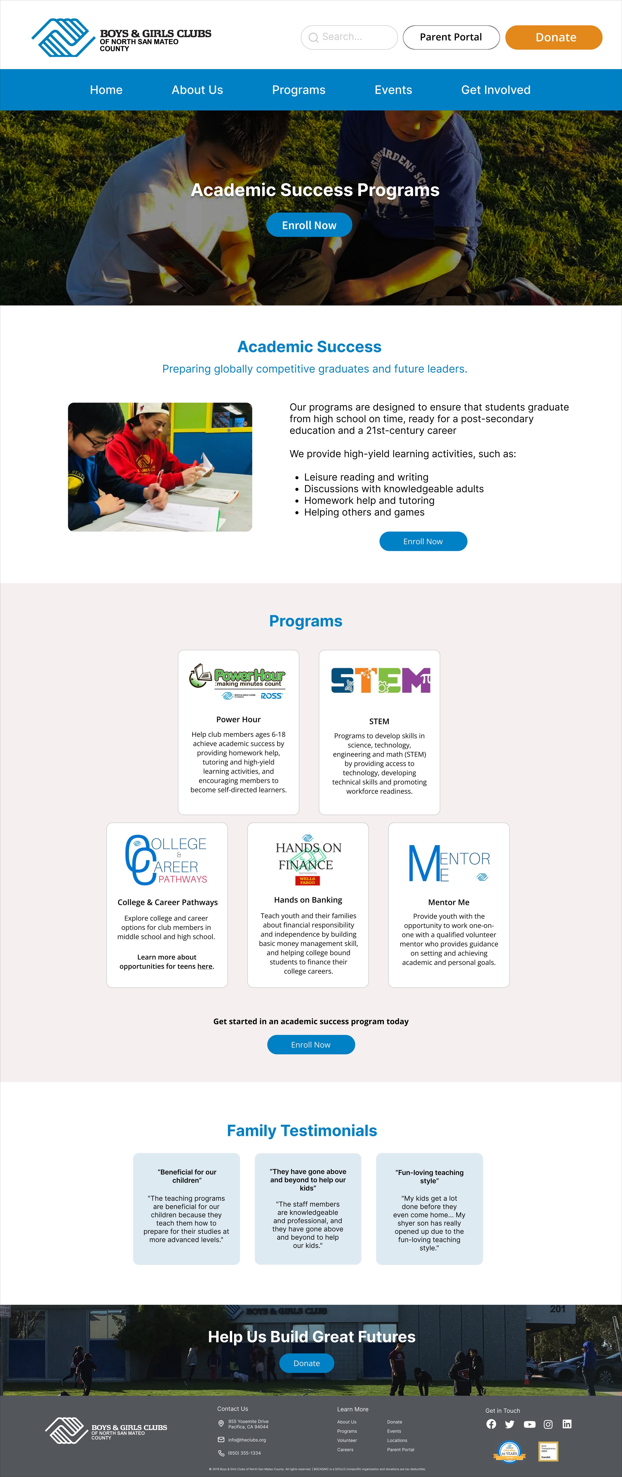

Simplified information architecture: An easier navigation structure to optimize the user flow of the website.
Fun and engaging visual style: A vibrant and family-oriented visual style through the use of colours and images to cater to families with children.
Clear user flow: A step-by-step guide for the enrollment process, making it easier for users to sign up for programs.
Improved user assistance: A new FAQ section and inquiry submission form ensures a smoother user experience by addressing common questions.
Prominent call-to-action: The new website highlights the donation functionality as a primary call-to-action, which helps enabling contributions to support the organization.
Family testimonials: First-hand experiences from families bolster engagement and visibility, showcasing the positive impact of the organization in the community.
PROTOTYPE
DESIGN IMPACT
3 months after the website redesign, we reconnected with the client to evaluate the improvements. The client reported a decrease in customer service inquiries as the registration walkthrough has become more clear and less confusing. The new FAQ section has also helped address common questions, helping to provide additional support to the registration process. The reduction of clutter also resulted in a clearer visual hierarchy and navigation process, as there is an increase in the engagement rate.
REFLECTION
Iterate rigorously and continuously.
A collaborative effort between the client and the design team is important to iterate designs that can truly provide an improvement in the user experience, solve our client’s concerns and orient the design towards the target market.
Considering technical and financial feasibility is a crucial part of design.
During the design process, one of the main focuses was to consider the technical feasibility of the CMS platform used to create the client’s website. Therefore, we learned to design the website in a way that is easy for the client to maintain, while not compromising the user experience.
Handover is an important process too.
We wrapped up the project with a detailed documentation that explains design decisions, rationale and what the client should do to maintain the website in the future. Through this process, I learned about the importance of communicating an efficient handover in order to ensure that there is a smooth transition process.
OUR CLIENT’S FEEDBACK
"The opportunity to work with Develop For Good has been instrumental in the advances of our brand. The team listened to our concerns, clearly articulated the needs of our organization and community, and developed a plan to help reach our goals. Throughout the process we felt supported and heard, allowing us to leave the designing and implementation in Develop For Good's capable hands. The final product has been jaw-dropping. Our website has a clear audience in mind, there is ease of access, and the aesthetics have never looked better!"
Mandy Lipp, Executive Director